Equity Curve
Quick definition
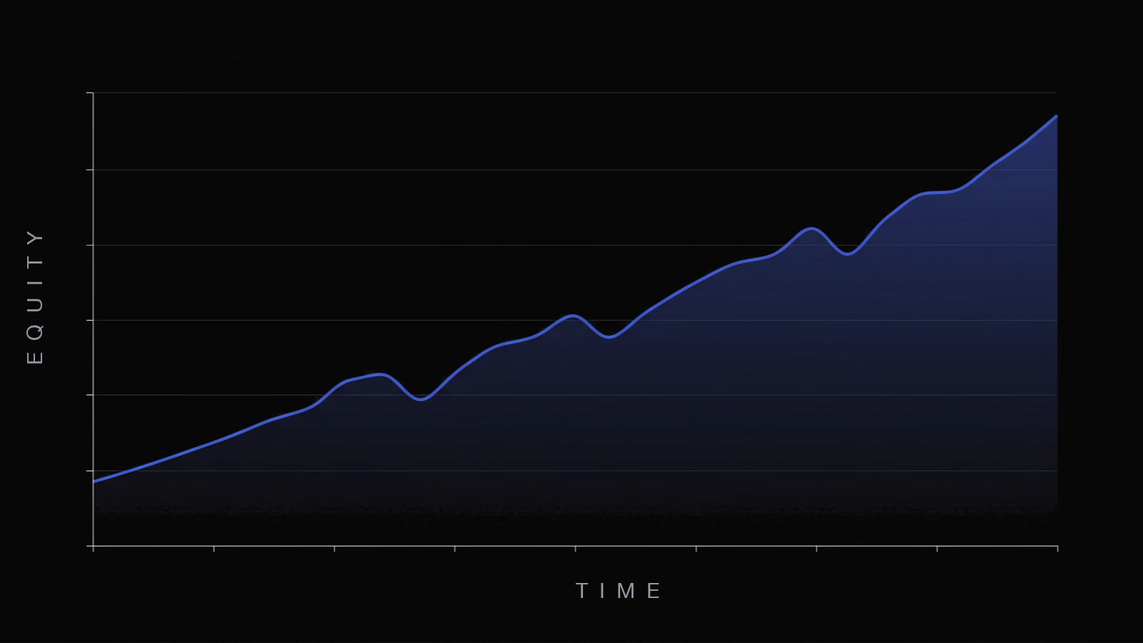
Equity Curve: An equity curve is a line chart of your account balance over time, plotted trade by trade or day by day. A smooth curve rising from the bottom left to the top right points to a steady edge, while a jagged or falling curve flags inconsistency or a strategy that has stopped working.
An equity curve is a line chart of your trading account's value over time, plotted as each trade or each day moves your balance up or down. It is the single clearest picture of how a strategy is performing. A line that climbs steadily from the lower left to the upper right shows a working edge, while a flat, jagged, or falling line shows a strategy that is struggling or has stopped working. Where individual metrics like win rate and profit factor describe pieces of your trading, the equity curve shows the whole story at a glance.
How to Read an Equity Curve
Three things tell you most of what you need to know:
- Slope. Which direction is the line heading, and how steeply? A consistent upward slope means the account is growing. A flat or downward slope means it is not.
- Smoothness. A smooth, steady climb suggests a reliable edge and controlled risk. A jagged line with violent swings up and down points to inconsistent results or oversized positions, even if the line is rising overall.
- Drawdowns. Every dip from a peak to a later low is a drawdown. How deep the dips run, and how long they take to recover, tells you how much pain the strategy puts you through to make its returns.
The horizontal axis is usually time or trade number, and the vertical axis is account equity. Most traders plot it on closed trades, though tracking it including open positions shows the real-time swings you actually feel.
What a Healthy Equity Curve Looks Like
A healthy equity curve rises from the lower left to the upper right at a fairly steady angle, with shallow, short-lived dips rather than deep, drawn-out ones. The ideal is boring, a line that grinds upward without dramatic spikes. A curve that rockets up in one stretch and collapses in another, even if it ends higher, usually points to inconsistent risk or a strategy that only works in one kind of market. Smoothness matters as much as direction, because a smooth curve is one you can actually keep trading through. The steep, jagged curve is the one traders abandon at the worst moment, right at the bottom of a swing.
Equity Curve and Drawdown
The equity curve and drawdown are two views of the same data. The curve shows where your equity is; the drawdown measures how far it has fallen from its highest point so far. Every peak-to-trough drop on the curve is a drawdown, and the deepest one is your maximum drawdown, the standard worst-case risk number. Reading them together is what separates a strategy that merely makes money from one you can hold. A curve that climbs but spends long stretches in deep drawdowns is far harder to trade than a slower, smoother one. Some traders even use the curve as a signal, easing off size when equity falls below its own moving average and stepping back up when it recovers.
Key Takeaways
- An equity curve plots your account value over time, the clearest single view of how a strategy is doing.
- Read its slope (direction), smoothness (consistency), and drawdowns (the dips) together.
- A smooth, steady rise is healthier than a jagged climb to the same endpoint, because you can actually keep trading it.
- The curve and drawdown are two views of the same data, so read them side by side.
Common Mistakes
The most common mistake is watching only the endpoint of the curve and ignoring the path it took. Two accounts can finish at the same balance, but the one that got there smoothly is far more trustworthy than the one that swung wildly. Another is reading too much into a short curve. A few weeks of trades is noise, and a clean-looking line over thirty trades can reverse fast. Traders also confuse a rising curve with a safe one, missing the deep drawdowns along the way that reveal how much risk is really being taken. And steepness is not the goal. An unusually steep curve is often a sign of oversized risk that will eventually produce an equally steep fall.
How JournalX Tracks Your Equity Curve
JournalX builds your equity curve automatically from your logged trades and plots your drawdown right alongside it, so you see both the climb and the dips in one view. You can filter the curve by account, setup, symbol, or session with stackable filters to see which strategies are driving the growth and which are dragging on it, and read it next to your expectancy, win rate, and profit factor. Instead of guessing how your account is trending, you get an honest picture of the shape of your performance over time.
Related terms
Frequently asked questions
What does an equity curve show?
It shows the value of your trading account over time, plotted trade by trade or day by day. The slope shows whether you are growing, the smoothness shows how consistent your results are, and the dips show your drawdowns.
What does a good equity curve look like?
A good equity curve rises steadily from the lower left to the upper right with shallow, short dips rather than deep, prolonged ones. A smooth, almost boring climb is healthier than a jagged line that reaches the same point through violent swings.
What is the difference between an equity curve and a drawdown?
The equity curve is the full line of your account value over time. A drawdown is a single drop on that line from a peak to a later low. The deepest drawdown on the curve is your maximum drawdown, the standard worst-case risk measure.
What is equity curve trading?
Equity curve trading means using the curve itself as a signal, often by comparing it to its own moving average. Some traders reduce position size when their equity falls below that average and increase it when equity climbs back above, aiming to trade more when the strategy is working.