The Hammer Candlestick Pattern
The hammer candlestick pattern shows sellers losing control after a decline. How to spot a valid hammer, why location decides its meaning, and how to test it.
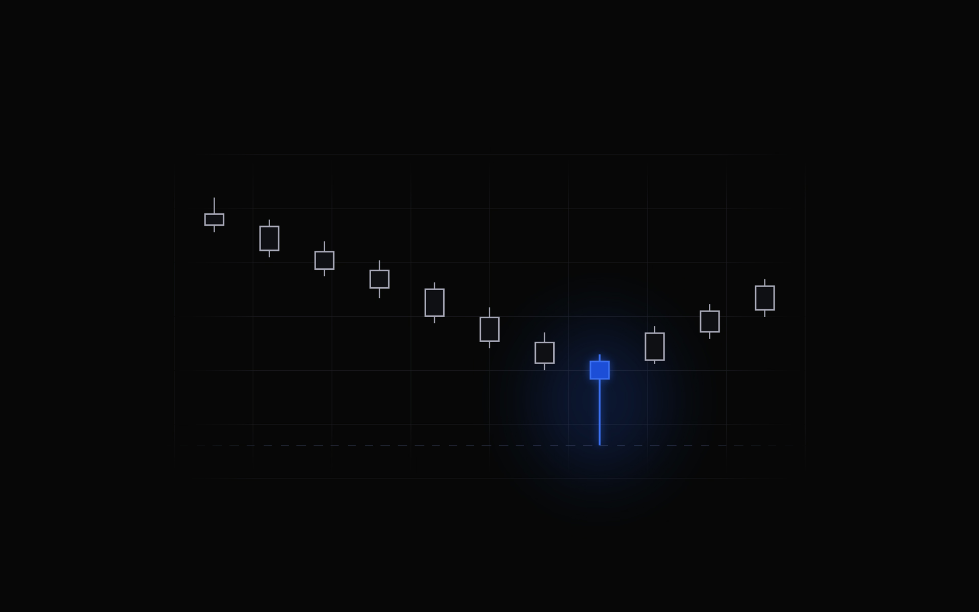
The hammer candlestick pattern is one of the first shapes most traders learn to spot, and one of the easiest to misread. The shape takes about ten seconds to understand. What takes longer is learning that the same shape means completely different things depending on where it appears, what came before it, and what the next candle does. This guide covers the anatomy, the rules that separate a real hammer from a candle that merely looks like one, the candles it gets confused with, what the published research actually says about how well it works, and how to find out whether it works on your charts instead of trusting someone else's number.
What a hammer candlestick is
Every candlestick records four prices for one period of time. The open, the high, the low, and the close. The rectangle in the middle, called the real body, spans the open and the close. The thin lines above and below it, called shadows or wicks, stretch out to the high and the low. That is the whole vocabulary.
A hammer is one specific arrangement of those four prices. Almost the entire range of the period sits below the body. Price opened, sold off hard, and then recovered so completely that it closed back near where it started or higher. The long lower shadow is a record of every price that got offered and refused.
The candle gets its name from how it looks, a small head with a long handle hanging down, and from the idea that price is hammering out a floor. The name is memorable. It is also the reason so many traders stop at the picture and never learn the rules underneath it.
The four conditions that make a hammer valid
Three of these describe the shape. The fourth describes where the shape appears, and it is the one most people skip.
| Condition | What to check |
|---|---|
| Small real body | The body sits in the upper third of the candle's total range |
| Long lower shadow | At least twice the height of the body, and many traders want three times |
| Little or no upper shadow | Ideally under about 10 percent of the total range |
| A decline in front of it | The candle has to follow a move down, not a move up |
Thomas Bulkowski, who catalogued candle statistics across thousands of charts, defines it as one candle in a downward price trend with "a long lower shadow at least two or three times the height of the body with little or no upper shadow." Nothing in that definition is about intuition. Every part of it is measurable.
That matters more than it sounds. Two traders looking at the same chart will disagree about whether a candle is a hammer roughly as often as they agree, because "long lower shadow" is a feeling until you attach a number to it. Pick your ratio, write it down, and apply it the same way every time. A pattern you define loosely cannot be tested, and a pattern you cannot test is just a habit.
What the candle is actually telling you
Read the hammer as a story about one period of trading. Sellers had control for most of it and drove price down. Then, somewhere near the bottom, the selling ran out of buyers willing to sell lower, or buyers stepped in with enough size to absorb it. Price climbed back and finished near the top of the range. Whoever sold in the lower part of that candle is now underwater.
Two things follow from that. The first is that a hammer is evidence about the past, specifically that supply got absorbed at those prices once. The second is that this evidence has a size. A hammer on a daily chart summarizes a whole session of that fight. A hammer on a one-minute chart summarizes sixty seconds. The shape is identical and the weight behind it is not.
The candle also cannot tell you who did the buying. It might be a large buyer starting a position, or it might be short sellers covering, or it might be nothing more than a thin book on a quiet afternoon where a few orders moved price further than they should have. Volume is the closest thing you have to a read on that. A hammer that forms on well above-average volume means a lot of participants took part in the rejection. A hammer on unusually light volume may just be a gap in liquidity wearing a nice shape.
Location is what gives a hammer meaning
This is the part that separates traders who use the pattern from traders who collect it. The same candle carries three different amounts of information depending on where it lands.
After an extended decline, at a level price has turned at before. This is the textbook case. The decline gives the candle something to reverse, and the level gives other traders a reason to be watching the same spot. Prior swing lows, the bottom of a well-tested range, and moving averages that a market has respected for months all qualify. Bulkowski's own tests point the same way. He found hammers perform best when they appear within a third of the yearly low.
In the middle of a sideways range. Chop manufactures hammer-shaped candles constantly, because price is oscillating with no directional pressure behind it. There is no meaningful decline for the candle to reverse, so the long lower shadow records ordinary noise rather than a fight over value. These are the hammers that quietly ruin a trader's sample.
Partway down a strong, orderly downtrend. Downtrends produce plenty of hammers on the way to the bottom, and most of them are pauses rather than turns. A market that has been making lower highs and lower lows for weeks has a supply problem that one candle rarely solves. The pattern still deserves attention here, but as a reason to look closer, not as a conclusion.
The useful mental shift is to stop treating a hammer as an answer and start treating it as a place to ask a question. The candle tells you where a fight happened. Everything around it tells you whether the fight mattered.
The candles a hammer gets confused with
Four common candles share a family resemblance, and mixing them up is the single most frequent mistake with this pattern.
| Candle | Shape | Where it forms | Usual read |
|---|---|---|---|
| Hammer | Small body up top, long lower shadow | After a decline | Possible bullish reversal |
| Hanging man | Identical to a hammer | After an advance | Warning that buyers are tiring |
| Inverted hammer | Small body at the bottom, long upper shadow | After a decline | Possible bullish reversal, weaker |
| Shooting star | Identical to an inverted hammer | After an advance | Warning of rejection at highs |
| Dragonfly doji | No real body at all, long lower shadow | Either | The extreme version of a hammer |
Look at the first two rows again. A hammer and a hanging man are not similar candles. They are the same candle. Nothing about the open, high, low, or close distinguishes them. The only difference is the direction of the trend leading in.
Sit with that for a second, because it settles an argument. If one shape can be bullish or bearish purely on the basis of what came before it, then the shape was never carrying the meaning. The context was. Every other rule in this guide follows from that one fact.
You will also see the whole family called pin bars in price-action circles. It is a broader term covering any candle with a small body and one dominant wick, so most hammers are pin bars but plenty of pin bars are not hammers.
Confirmation, and what it costs you
An unconfirmed hammer is a hypothesis. Buyers won one period. Nothing says they win the next one.
The usual confirmation is simple. Wait for the following candle to trade and close above the hammer's high. That turns "sellers got pushed back once" into "the push held for a second period." Some traders add filters on top, like requiring the confirming candle to close above a nearby level or to arrive on rising volume.
Confirmation is not free, and most guides skip the price you pay for it. Waiting cuts down on false starts, but it also means you enter higher while the invalidation point below the hammer's low stays exactly where it was. The distance between your entry and that level grows, which mechanically lowers the risk-reward ratio on the same target. You are buying a better hit rate with a worse payoff. Whether that is a good trade depends entirely on the sizes involved, which is a question your own records can answer and a guide like this one cannot.
The structure a hammer gives you
The reason this pattern stays popular is not its accuracy. It is that a hammer hands you a clean set of reference levels, which is more than most chart shapes do.
- The high is the trigger reference. It is the level that says buyers followed through.
- The low is the invalidation point. If price trades below the bottom of that shadow, the rejection the candle recorded has failed. The idea is finished, and you know it without having to interpret anything.
- The distance between them is one unit of risk, or 1R. Every outcome from there can be measured in multiples of that distance.
Here is the part that catches people out. The more dramatic the hammer, the wider that gap is. A candle with an enormous lower shadow looks like the strongest possible rejection, and it also pushes your invalidation level a long way from your entry. Held to the same target, that trade is worth fewer R than a tidier hammer with a shorter tail. The most visually impressive candle on the screen is often the worst structure on the screen.
How reliable is the hammer candlestick pattern?
Bulkowski's statistics for the hammer, drawn from the Encyclopedia of Candlestick Charts, are the most quoted numbers on this pattern, and they are worth reading closely because they say two things at once.
- The hammer acts as a bullish reversal 60 percent of the time, which ranks it 26th out of 103 candle types for reversal rate.
- Its overall performance rank is 65 out of 103, where 1 is best.
Read together, those are a warning label. The pattern turns price more often than not, and the move that follows tends to be mediocre. That combination is exactly how a pattern with a respectable hit rate ends up flat or negative once costs are included, because what decides an account is not how often you are right but how far the moves go relative to what you risked. This is the same trap covered in why a 70 percent win rate can still lose money, and the hammer is a textbook example of it.
There is a second, quieter caveat. Those numbers came from a particular universe of markets, on a particular timeframe, using a particular definition of the pattern. Change the market, the timeframe, or your ratio for "long lower shadow" and you are no longer measuring the same thing. Published statistics are a good hypothesis to start from. They are not a result you can inherit.
How to find out whether it works for you
The honest answer to "does the hammer work" is that it depends on your market, your timeframe, your definition, and what you do after you enter. That sounds like a dodge until you realize it is testable. Here is the process.
1. Write your definition down before you take a single trade. Body in the top third, lower shadow at least twice the body, upper shadow under 10 percent of the range, following at least five candles of decline. Your numbers can differ from those. What matters is that they exist on paper, because a rule you carry in your head quietly bends toward whatever you want it to say.
2. Tag every hammer trade with the same setup name. One name, spelled the same way every time. This is the whole basis of being able to pull the group back out later. If you are not journaling in a structured way yet, how to keep a trading journal covers the fields worth capturing on every trade.
3. Record the context as separate fields, not as prose. Confirmed or unconfirmed. At a level or in open space. Trend or range. Timeframe. Volume above or below average. Buried in a notes field, these details are unusable. As their own fields, they are the variables you get to test.
4. Wait for a real sample. Five hammer trades tell you nothing at all. Patterns in the numbers begin to mean something over a few dozen trades on a single variant, and the read gets dependable over a few hundred. Judge the sample, never the last trade.
5. Read the metrics as a group. Expectancy first, because it is the average profit or loss per trade and it decides the account over time. Then win rate next to average win and average loss, because win rate alone will flatter you. Then profit factor for how much you make per dollar lost, and maximum drawdown for whether you could actually sit through it.
6. Split by one variable at a time. Confirmed against unconfirmed. At a level against not at a level. Trend against range. The usual finding is that the pattern is neither good nor bad on its own, and that one variant is carrying the whole group while another quietly drains it.
This is also the natural thing to work through in a weekly trade review, where you are already grouping trades by setup and reading the metrics for each group.
Common mistakes
- Eyeballing the ratio. "That looks like a long wick" is not a rule. Measure the shadow against the body, every time, with the same number.
- Ignoring what came before the candle. A hammer with no decline in front of it is not a hammer. This is the error that fills a sample with noise and makes the pattern look worse than it is.
- Treating the candle as a conclusion. It marks a place worth examining, not a decision that has already been made.
- Trading every hammer on a low timeframe. Fast charts produce the shape constantly. Frequency is not opportunity.
- Judging the pattern on your last three trades. Three trades is a coin flip with an opinion attached.
- Changing the definition after a loss. Loosening the rule so a losing trade "wasn't really a hammer" is the fastest way to make your own data useless.
Putting it together
The hammer candlestick pattern is worth learning precisely because it is so easy to get wrong. The shape is trivial. The value sits in the three things around it, the decline that gives it something to reverse, the level that gives other traders a reason to be watching, and the next candle that either confirms the push or does not. Get those right and you have a defined idea with a clean invalidation point, which is more than most chart patterns offer.
What you should not do is take anyone's win rate on faith, including the ones in this guide. Define the pattern in writing, tag it the same way on every trade, gather a real sample, and read expectancy alongside your average win and average loss. The hammer either earns its place in your process or it does not, and the only chart that can settle it is your own.
Find out which setups actually pay
JournalX tags every trade by setup, then computes expectancy, win rate, and profit factor for each one, so you can see how the hammer performs for you instead of guessing.
Frequently asked questions
Is a hammer candlestick bullish or bearish?
A hammer is read as bullish, but only when it appears after a decline. The identical shape after a rally is called a hanging man and is read as bearish. The shape on its own does not decide the meaning, the location does.
What is the difference between a hammer and a hanging man?
The two candles are identical in shape. A hammer forms after a move down and is read as a possible bullish reversal. A hanging man forms after a move up and is read as a warning that buyers are losing control. Only the trend leading into the candle tells them apart.
Does the color of a hammer candle matter?
Both colors qualify, because either way the close finishes near the high of the range. A close above the open is usually read as slightly stronger, since buyers finished the period above where it started. Thomas Bulkowski's research found white-bodied hammers performed better than black-bodied ones.
How reliable is the hammer candlestick pattern?
Thomas Bulkowski's data in the Encyclopedia of Candlestick Charts puts the bullish reversal rate at 60 percent, with an overall performance rank of 65 out of 103 candle types. Published rates shift with the market, the timeframe, and the exact definition used, so treat any number you read as a starting hypothesis and measure the pattern on your own trades.
What timeframe is best for hammer candlesticks?
Higher timeframes produce fewer and cleaner hammers because each candle summarizes more trading activity. On very low timeframes hammer-shaped candles appear constantly and most carry little information. Instead of hunting for one best timeframe, tag the timeframe on every trade you take and compare the results across them.